the bold prize
rebrand / pitch deck / social media assets / logo development
completed in 2020
case study breakdown
the client.
founded by returning Poché client and perpetual do good-er, Sabrina Hersi Issa, The Bold Prize is a crowdfunded leadership award intended to uplift, honor, and champion courageous Black, women leaders. in a world where Black women must navigate difficult professional environments where they are often overlooked and isolated, The Bold Prize award is a small, tangible gesture to say: ‘We see you. We got us.’
the challenge.
what started out as solely a logo development project evolved into a full rebrand comprised of a custom deck and branded assets. The challenge here laid in creating an eye-catching logo that merged fun, femininity, and Blackness into a visual descriptor that would serve as the brand’s primary identifier. it was vital for the logo to be enough to stand on its own— similar to the women the brand aims to serve.
the solution.
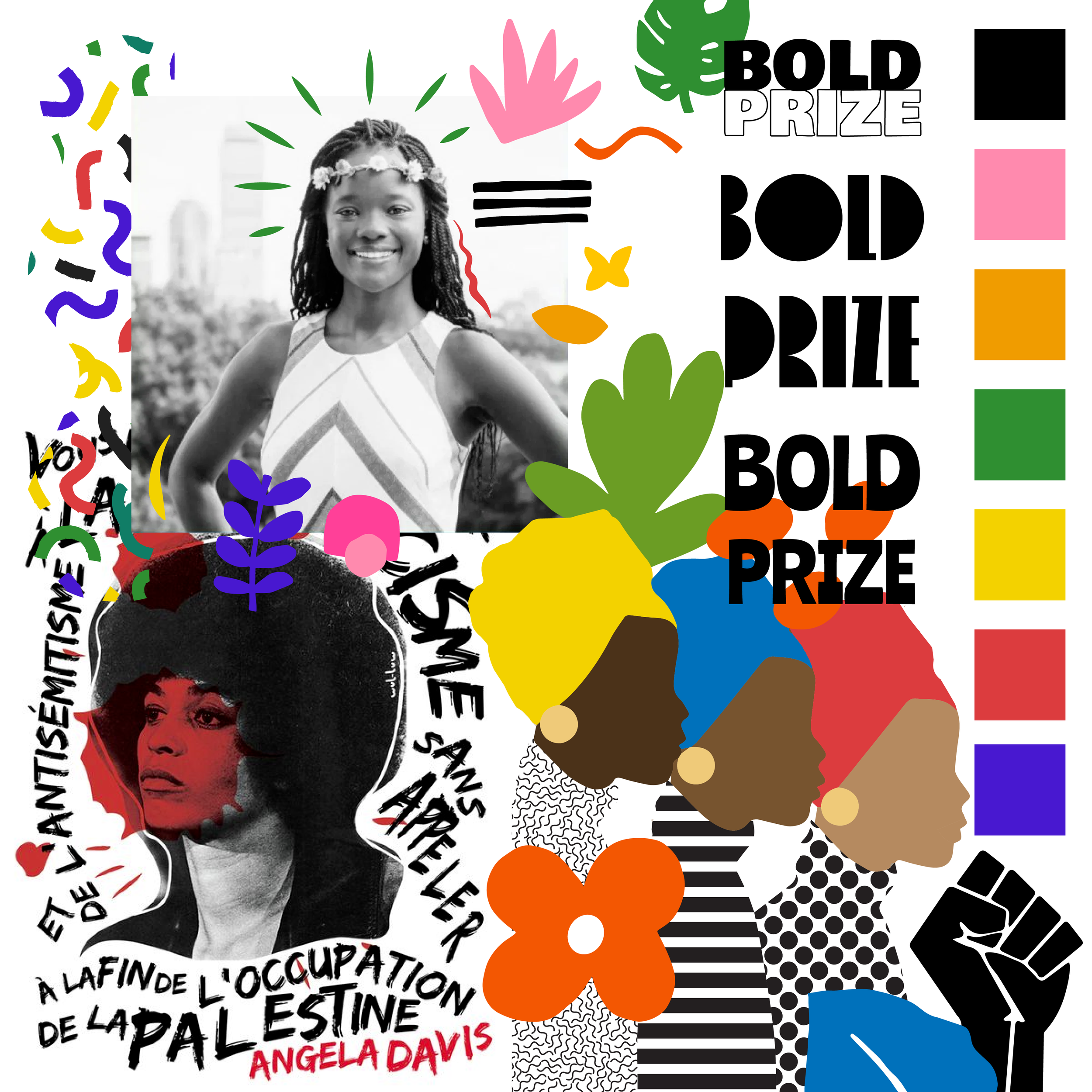
pulling directly from the project’s moodboard, we extracted bold color ways, playful shapes, and experimental typography styles. the final products are a direct result of starting strong and making sure the client’s initial interests and ideas remain prevalent from start to end.
the poché way.
rather than oversell clients with boring design jargon, we prefer to show them how to improve their brands through the use of technical (and often playful) practices that are equally effective and powerful. we’ll make sure your brand reflects who you are and what matters most.

The Bold Prize ~
The Bold Prize ~
still scrolling? you must like what you see. no worries. if we did it once, we can do it again— and would love to do it for you!
the poché approach.
logo breakdown.
starting with the Black power fist, it was important that the final product clearly convey Blackness in a way that was easily identifiable. because the award name gives itself away, the solution was approached by exploring various typefaces and color palettes. after various iterations, the solution ultimately was to merge bold typography and bold colors.
when looking at the logo from afar, it appears abstracted in such a way that only the iconography element is present. once closer, it morphs into an interesting play between a typographic and iconographic logo that still maintains a sense of femininity, audacity, and play.

moodboard
branded assets


